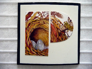
I have enjoyed doing these 4 letters as they allowed more of the painted image to be seen, the O acts as a magnifying glass, so as to be able to see the feather close up.
As one will see I still have straight line problems, some black edges wider than others.
As you may have guessed I am particularly fond of nests and feathers.


And I still think they would look very nice on my passage wall!
ReplyDeleteCould you, perhaps, post a photo of the original artwork? Or have you cut it all into pieces!
Hi Dinahmow.
DeleteWould it be correct for me to post a full image on this blog spot?
There are multi images used, and no, I haven't cut up the originals, these images are taken from a set of cards that I have had printed. Would a set of cards suffice?
Looking good, Mrs R XXX
ReplyDeleteI just love these...and I wouldn't worry about a little variation in the black edges - they are so beautifully unified regardless.
ReplyDeleteArzigoglare,
Deletethank you so much for your comment, I won't worry any more, you are right the subject and colours, unify them.
Thank you my dear friend Noela, thank you for pushing me, now I feel I can fly....interesting when it comes to making a book though, never done that before
ReplyDeleteSandra i continue to be delighted by the letter forms- the shapes they make as you cut them out fascinate me, and then I get to gaze into them. I love the description of the O as a magnifying glass, and I do think very few eyes wander out to a slightly less than straight black line - they are too busy gazing at the letters!
ReplyDeletePS - feel free to show an image of the originals - I think that adds interest to the process for sure.
toujours aussi beaux! pareils et pourtant différents c'est vraiment magnifique
ReplyDelete