Thursday, January 31, 2013

January Letters for Peace.

These are the first letters for this year.  Peace to me means quiet and restful so I wanted and alphbet that reflected this.  So I wrote peace in many languages at 45 degrees across a large piece of paper in blue extended type script.  Cut the paper into squares so that when put together the writing still reads across the blocks.
What to write on top was the next question so decided to pen on monoline a versal type roman capital incorporating the peace symbol into each one.  Got so involved I finshed the whole alphabet!
Have not yet decided how to mount them, more thinking.  kept this alphbet very simple as the last one took so long I needed a break and feel very relieved that I am a few months in advance.
This is a block of four.

Wednesday, January 30, 2013

Sally's Peace Alphabet - first 4 letters

 Here are some images of my work on the first 4 letters of the "peace" alphabet assignment. I usually start a lettering project with lots of thought before even putting pen to paper. Wanting my alphabet to be "peaceful" I decided I wanted them soothing, gentle, soft edges, sans-serif, simple. These are words I kept coming back to. As I said in a few comments of others' work, I realized that I also kept going back and forth with "peaceful" vs. "peace" or "attaining peace" which each conger very different things for me. Peace is fragile - yet my letters are sturdy. PeaceFUL - congers simple, solid, yet attaining and maintaining peace is anything but simple. So, it really shows what a variety I'm sure we will all come up with!!


I started out with pencil. I wanted a mono-line letter (no thicks/thins). I was thinking of rounded ends - but then I thought the letters looked too casual and cartoony. I finally decided to render my alphabet using a brush with an ink wash. I decided on lower-case letters which, to me, are "simpler" less "fussy" than caps.  I am going to emboss the letters for the final project.


I transferred the images to Bristol board to make the embossing template. The letters fit into the 7cm x7cm frame, but I've made the embossing template slightly larger just so I can handle them more easily.


You will notice here that I had initially prepared the templates backwards! (I glued the counter shape onto a translucent paper that is on the back of the Bristol board). I could have de-bossed the letters, but in the end, I fixed them so the templates are "backwards" and the resulting embossed letter will appear correctly.


Here, I embossed letters on individual 7cm x 7cm squares. I'm thinking the final project could be an exemplar with all the letters embossed in an interesting composition on one sheet of paper.Thinking ahead to simplifying the rest of the alphabet, I  might have to return to previous letters to "tweak" them so they all "fit" together as an entire alphabet. 

I have realized with this experience that I am not a very good photographer!!

Tuesday, January 29, 2013

'Miró's Little Toe' alphabet

Hello everyone! I am so proud of myself today. It's Tuesday 29 January and I have finished my first four letters for the ALAW 2013 project. It's quite a feat, because many things have happened in the past month. I'll write about them in my own blog right after I post this entry.

Miró's Little Toe alphabet

On 15 January I put in the mail my sketchbook for the Sketchbook Project 2013. I blogged about it, so I won't repeat the details here. I am only mentioning it because it was my work on the sketchbook that inspired this alphabet. Same style, similar doodles. It humbly reminds me of Joan Miró's work and I had great fun doodling out of character (for me). So I came up with a fun name for it: Miró's Little Toe.
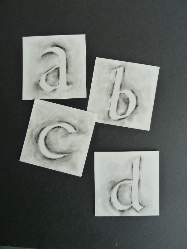
a - A

As you can see, each design includes a lower-case and a capital letter. The palette changes on a whim, in keeping with the playful character of the letters.

b - B

I am using graphite, watercolour and china ink, not necessarily all of them on every letter. Everything has been drawn and painted by hand.

c - C

I started out with a large sheet of fine-grain watercolour paper where I traced the 26 7 x 7 cm squares allotted to each letter. Then I doodled haphazardly all over the sheet, without thinking about the letter-forms or their final placement.

d - D

Then I cut along the straight lines and shuffled the 26 pieces of paper just as if they were a deck of cards. Only then did I go through the random doodles to see which ones were suitable for which letter. A, B, C and D are finished. The rest of the alphabet still needs to be re-shuffled and investigated. More to come in February.

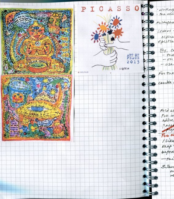
P.S. This is obviously my free-style alphabet for the year.  I wanted to start with the Peace alphabet but haven't been able to decide on the process. Too many ideas, some of them quite complex, involving fabric and/or stitching. I am pressed for time now that I am preparing my solo exhibition in May, so Miró's Little Toe was the easy way ahead. Please don't step on it!

Another newcomer.....Hello!


Hello!  My name is Helen Thomas and I live in Bristol, UK.  I retired from a long civil service career about 3 years ago.  Freed at last from the day-job, I have been developing my drawing and printing skills through a series of short courses and a part-time Foundation Diploma in Art and Design at the Bristol School of Art.  I have been making quilts for many years (I'm a member of the Quilters' Guild Contemporary Quilts Group), but working in media other than textiles is new.    

I've been watching ALAW via the blog for ages, and admiring the many beautiful interpretations of the idea.   So when the call came for members ready to join for challenge in 2013, I took a deep breath and signed up.   And then panicked!  I am very new to making my own art, and this challenge is very public and therefore very scary.   But everyone has to start somewhere, so I am plunging in, and have been pondering quietly about how best to integrate my ALAW alphabets into my work as a printmaking student.  Recent difficulties with blogger have also delayed my introduction to the group, but I hope I've got those sorted out now.

In October 2012 I began an MA in Multidisciplinary Printmaking at the University of the West of England, Bristol, and the first module has been a series of workshops to introduce us all to a range of printmaking methods as the basis for developing our individual work over the rest of the 3-year course.  I actually have very little experience in print-making, so each workshop has been a real adventure for me.  We have experimented with etching, screen printing on paper and textiles, plate lithography, monoprint and relief printing with both lino and collagraph plates, and letterpress.  We have also had workshops on book-binding and enamelling, and had introductions to digital photography and printing onto ceramics.   

Recently, we learned how to laser cut using images prepared in Adobe Illustrator.  I imagined that laser cutting would merely give you interestingly shaped pieces of wood (or card, plastic, perspex, lino, leather, fabric, whatever - anything but metal).   What I did not know until now is that you can also set the laser to burn into the material, but not to cut right through it, and also you can take out broad areas of the surface, not just a drawn line.  And  this allows you to make plates for intaglio or relief printing.  This is the first simple piece I designed and cut.  The piece on the right is an etched version, which should be useable as a printing plate using an etching press.

I have also recently discovered that you can create a computer font made from your own handwriting:  I used an i-pad app called i-font maker (the link is here 2ttf ).  My first attempt looks something like this...but the possibilities are endless.


So suddenly I found I had an idea for my first ALAW 2013 alphabet:  I have created a personal font (actually, several - it is quite addictive once you start) and will use this to create files for laser cutting from which I will print each letter. 

On Friday, after quite a lot of struggle to get the hang of Adobe Illustrator, I made files for letters a,b,c and d, in both upper and lower case, and in two different formats for each letter: one will  will cut out the shape of each one (which of course also gives you the negative shape left behind) and the other will etch the outline of each letter.   Time was against me but I did manage to get two test pieces cut - one etched and one cut-out - using grey-board.  Here they are....


I plan to play with these over the next few days before making more Illustrator files for getting further letters cut at college next week.  

My plan is to use these in various forms of printing - I will cut some of the letters in lino and some in card for use as relief prints.  For some, I may be able to use the cut-out shapes for embossing.  Some I plan to etch into perspex to use as intaglio plates through the etching press.  Some I can print onto paper of various kinds, and some may be on fabric.  Some letter shapes may work better in some kinds of print than in others.  

I may decide that one method works particularly well, and stick to that for the entire alphabet.   I do need to think about the overall coherence of the set, so some of my experimenting may not see realisation in the final set of letters.   There is also a choice to make about whether to use all upper or lower case, or whether to stick to one uniform alphabet throughout, or whether to mix and match between several fonts.  I am clear that I will only use fonts which I have created myself.  

I hope that this project will serve several purposes: first and foremost, it will be my first set of letters for ALAW 2013.  But it will also encourage me to experiment with lots of different approaches to print using simple letter forms, it will get me familiar with creating Illustrator files and using different materials for laser etching and/or cutting, and will also challenge me to find a good way of bringing all the letters together, in a book-form or otherwise, when all 26 letters are complete.

I think this is going to be a great project for the next few months, and the fact that it is going to be very public, via the ALAW 2013 blog, adds to the sense of excitement.  

Saturday, January 26, 2013

2012 wrap up

It's late, I know, but I just finished my second alpha presentation and wanted to share.  I have been so impressed with all the alphas started so far this year and am eager to catch up but I felt like I needed to finish this one first.

A quick recap:  my theme is flowers, using my own photography I printed images of flowers starting with each letter of the alphabet and then created pockets to hold the images.  I used 140lb watercolor paper as the book pages and this is my first attempt at a stitched binding.  Can't wait to try other bookmaking styles this year!

beads added to the binding


Now, I'm off to make some decisions about my first alpha for this year!


Tuesday, January 22, 2013

First Letters For Peace

I thought long and hard about Peace before putting pen to paper and agree totally with Fiona's words on Paper Ponderings:-

It is pretty hard for me to actually, really influence world peace. I'm not in the UN, I'm not a conflict negotiator, I'm not in charge of any armed forces rebel or otherwise; and I'm not running the country. My contributions on a world stage are going to be very very diffuse and small.

With this in mind I thought about what peace means to me, and what my most peaceful moments are. Firstly, I am usually in a peaceful frame of mind when I write calligraphy. Secondly, I have peace when I am outside, by myself, smoking a cigarette! I also use smoking as an excuse to escape from situations I don't want to be in, i.e if I am at a social gathering where I become irritated, bored, or simply don't like the direction in which the conversation is going, then I can simply pop outside for a cigarette and find peace.

With both these things in mind I thought about calligraphy and I thought about ephemeral nature of smoke - fragile like peace... anyhow, I can waffle on like this for ages. Here are the pics of my process so far:-


I chose the lower case roman hand for its simplicity, which I associate in my mind with peacefulness. I wrote it with a very large nib and then traced it.


I then used a black pastel and smudged it around the letter with a cotton bud to get a smokey effect. At the time I wanted to use charcoal, but I couldn't find it, but of course I have found it since! I will do my next four letters with the charcoal and see how they compare.


These weren't my first attempts. I did experiment with tissue paper, cigarette papers that I gummed together before writing the letter, and I also tried writing with cigarette ash and water... these ideas probably need a little more refining before publication :-)

Monday, January 21, 2013

Julie B Booth: Making Progress on Peace


 It's been wonderful to see the different directions everyone is taking with these first few letters. So inspiring to see how each of you is interpreting the Peace Alphabet.

I thought I'd show you my progress (I've also been posting it to my blog). I too, decided to start with Peace. There were so many possibilities. I started by doodling in my notebook.


I liked the idea of the letter forms becoming birds...in some cases doves. I envision that in most of the designs, the birds will be doing something towards peace (symbolized by the Peace sign...which I always think of as a dove's foot). In the final format, I will write something active about Peace such as Aspiring towards Peace; Believing in Peace etc.

Since I do a lot of hand printing on fabric, I decided to turn the designs into block prints. I made enlarged tracings of my initial doodles and transferred them onto Speedball Speedy Carve blocks which I carved with a linoleum carving tool. I had some fun making textured and patterned backgrounds.


I had a lot of ideas for how I wanted to use the blocks and have finally found my way after testing them on a piece of color-washed fabric.


I may change the color of the fabric paint a bit and will add some spots of color with stitched details.

I'm not exactly sure of the format yet...but am thinking about a series of small Peace flags.
Good morning all,

I thought I'd post pictures while I'm in one of those rare states (for me) - ahead of a deadline!


I have chosen uncial letters in pencil plus some muted colours in watercolour.  I teach pencil uncial letters as classes learn uncial, but it's always a step on the journey to pen made letters - they're not often used "for real", so I thought I'd celebrate them a little.
I was going to do something in a wabi-sabi style (from Wikipedia : beauty that is "imperfect, impermanent and incomplete").  Although it is all three of those things, I'm not sure I've captured the essence of wabi-sabi - but I'm going to see what happens over the coming months.
I've chosen a colour palette that I think is peaceful - not sure if this will be my peace alphabet or not!
(Can you see I'm not a planner but a wait and see sort of person...?)

I've made the structure already - it's a little book, and each time I create a letter square I'll add a little of the colour I used to the book cover.

Loving some of the other alphabets coming through - ALAW is going to be a great source of inspiration.

STARTING WITH PEACE


Almost the end of January and I'm still playing with ideas!
But to prove I am "working" here is a scrap of paper with some jottings for my "peace" alphabet.

Obviously, there are far more than 26 languages so I had to make a selection! If you enter the word peace into a translator you will find that quite a few languages have very loooong words!Another selection process.

This is still in its evolutionary stages, but I think I know where I'm going.


And the other alphabet? Still making decisions there, too, but I think I will work on "Peace
 first.
Di.

Sandra's first letters


I have chosen ‘Braggadocio Regular’ as my font, I like it because of it’s bulk, which gave me the facility
to use my own paintings with each letter.   I made stencils from each letter, then cut the finished ones out with a sharp Stanley knife.....what a fiddle that was,  I now have to think about how the finished item will come together....a few ideas swimming around.   The letters are not perfect....maybe by the time I get to Z they could be ????
Sandra


[posted by Noela]

Introduction: Lisa


It's been lovely seeing the new flurry of introductions—and even the first alphabetsbeing posted! I just wanted to introduce myself before we already find ourselves in February. I'm an American artist/writer who has been living in Florence for the last eight+ years. I fell in love with Florence while studying for my architecture degree, and finally traveled here for the first time in 1996. I felt very much at home on that initial visit, and returned as often as I could, until a research trip for a book I was writing about the piazzas turned into a permanent stay. The book was pretty much a full-time job until it was published in 2008; since then I've been able to devote more time to photography, artist's books and other paper-related work.

This is my second year participating in ALaW. I first joined because I love the idea of bringing text/words into visual pieces. When I started out, I imagined I would create artist's books to display my alphabets, but was surprised to end up with completely different solutions for the structure/presentation (click here & here to see the final pieces). And it seems that, yet again, I will be heading in the direction of something other than a book. I thought I'd share my progress so far, and hope you don't mind me recording some of my thoughts in this space.

As I was sitting at the studio table one day at the beginning of the year, looking at a pile of paper strips left over from another project, I found myself envisioning them as 'slipcases/covers' for little boxes...packaging peace somehow? I trimmed a couple to form 7x7x3-cm sleeves (shown in the foreground of the photo above), and began playing with the idea of this structure in my mind. How would the letters be integrated into the design? What would be inside of each box? How could the content relate to the individual letters of the alphabet?

At the moment, I'm working on a plan to incorporate both alphabets into a single 26-box piece. Since each box's 'sleeve' has two 7x7-cm faces, I'll feature capital letters on the tops, and create a separate lower-case alphabet for the bottoms. I'm experimenting with an olive branch motif as the basis for decorative letterssimilar to the idea of those Renaissance initials surrounded by patterns of leaves, stems, flowers and such—and will create a variation for the lowercase letters.

Each letter will correspond to a language that begins with that letter, and when you remove the sleeve from the box you will find the word 'peace' written in that language (along with the phonetic version for languages that use characters). I may also include other peace-related symbols/ bits and pieces in the boxes, for example, the Italian peace flag in the 'Italian' box, lyrics about peace by musicians from some of the countries, books about peace, etc. We'll see... In any case, I like the idea of discovering how people around the world express 'peace', and having the chance to learn more about other languages.

As we're about to enter Week Four, I'm aware of that sensation of already feeling 'behind' with this project. But exploring different ideas and working out the details are such an enjoyable part of the process (I think of this as the 'honeymoon' phase!)and essential before moving forward—so here's hoping those of us in the same boat will still have plenty of time to catch up once we establish a rhythm. I'm looking forward to sharing more soon, and continuing to see all of your ideas as they take shape...


Quite some challenge!

I knew straightway that the theme of Peace was going to be a challenge, but then that's what I needed.  I thought that the lettering, and the discipline would give me challenge sufficient, but along came the theme!  How does one deal with that visually in an alphabet?
I started by gathering examples of images of peace as found on Google, and pasted them into my notebook for inspiration.
I'm afraid that did not help me much, so I sat down to think about the concept of Peace itself, and ended up asking myself more questions than achieving any satisfactory answers.  Time meantime was passing, and the days were ticking past.
I said to myself: a letter a week, and the first week is almost by ... and then I said it again: a letter a week!  That was (probably) my solution.
I love writing letters.  The best relationship I had with my mother was when I could write to her - she loved those letters.  I really enjoy writing physical hand written letters to my close friends, just as I enjoy writing out notes of research and workings out.  So why not write a letter a week - each letter with its own letter, so to speak.
So, this is what I think* I shall do: *(I'm giving myself until the end of January to come up with a better solution) using the alphabetical letter concerned as a source of content words I shall write a letter exploring thoughts on the topic of Peace.  The letter should also include the capital letterform somehow.  (From now I shall call the letter an epistle, and the letterform a letter.)

Right.  So I knew that I had in my stash of paper a fine paper with a watermark which had up to now been useless (for prints), but would now be ideal.  Somehow I thought that airmail-like paper would be appropriate for the topic of Peace, so I painted the paper with a watercolour made of crushed soft pastel and water.
Once dry I drew an outline capital with a fine waterproof sepia Faber Castell Pitt S pen.  I was intending to write the epistle in black.  I found that drawing the letter was rather wobbly, and repeating it over did not help, so I'm glad that the epistle writing will distract from this - I hope!
Here is D whose words I am still collecting before composing the epistle this week:
This shows how the wash of blue forms a kind of sky-ness which I wanted rather than an all over flat colour.  I'm afraid I'm also exposing my arthritic wobbliness, but hey ho.  This is a personal challenge, not a competition.
I have also not written thesis level wisdom in the epistles (should I ever aspire to that, in any case!).  I am genuinely curiosity-driven about this whole topic of Peace now that it has been raised, and given the restriction of being spurred by the vocabulary beginning with the letter concerned, I am being conversational - and certainly not aiming at being profound!
As my fingers are becoming stiffer with the osteoarthritis, I find that the writing helps provide a useful alternate exercise from my other repetitive activities.  So, from a point where I thought that the challenge would be impossible, I think I'm more relaxed now.  I am certainly looking forward to see what everyone else does.