
Wednesday, February 27, 2013
Calligraphytique Letter's #Week 9
This 9th letter the "I" / Pour cette neuvième semaine, c'est la lettre "I"!


E,F,G,H
Here are my letters for february.
It' s difficult to take photos with the transparent papers i have choosen.
"H" is cut and ther is a little piece of "tarlatane" behind.
As I think of the final work, I make also the birds in origami, using diaries from different countries, as to symbolise the peace I hope, around the world.
It's really fine to see all the variety of designs and work that are showing up - each so beautiful in its own way!
See you later
Voilà mes lettres pour février.
J'ai un peu de mal à les photographier car c'est vraiment la transparence ou la légèreté des papiers blancs que je veux rendre. J'ai donc mis des photos sur une vitre, pour montrer cette transparence.
Le "H" par exemple est découpé et derrière j'ai mis un morceau de tarlatane blanche.
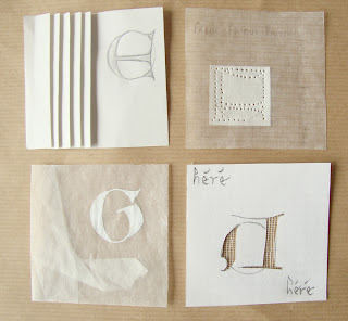 En pensant au montage final, j'ai fait des grues en papier journal de différents pays, symbolisant la paix souhaitée dans le monde. C'est vraiment super de voir toute la variété de travail possible autour de ce thème de la paix...
A bientôt
It' s difficult to take photos with the transparent papers i have choosen.
"H" is cut and ther is a little piece of "tarlatane" behind.
As I think of the final work, I make also the birds in origami, using diaries from different countries, as to symbolise the peace I hope, around the world.
It's really fine to see all the variety of designs and work that are showing up - each so beautiful in its own way!
See you later
Voilà mes lettres pour février.
J'ai un peu de mal à les photographier car c'est vraiment la transparence ou la légèreté des papiers blancs que je veux rendre. J'ai donc mis des photos sur une vitre, pour montrer cette transparence.
Le "H" par exemple est découpé et derrière j'ai mis un morceau de tarlatane blanche.

A bientôt
Tuesday, February 26, 2013
Terrie's first 2013 alpha
Better late than never! It took me a while to find my concept, practice some lettering, etc. So here are the letters I have done so far - which brings me up to date....

I decided to work on my 'peace' alpha second this time around so here's my intertwined letter alpha. I'm not sure if I'm going to add color and how/where, but I have a bit of time to figure that out. I think it's going to be presented in a spiral/scroll type format. I've sketched out preliminary ideas on the rest of the alpha but have some unresolved twining issues. But that's the challenge, right?
I'm sure loving the variety of designs and work that are showing up - each so beautiful in its own way!
Monday, February 25, 2013
Sandra's February Letters
I have chosen to stay with my own paintings as the body of the letter, I have put a 3D piece of my own ceramics into the 'F' letter, this also represents my passion with nests and eggs, the pillow being a metaphor for a nest, upon which an egg rests.


I have to admit I'm still having problems keeping my lines straight and evenly spaced, I have at last found my exacto knife, which sure beats a chain saw. I suppose I could define my letters as being slightly relaxed.
This is my first go at posting the letters myself, after an informative lesson with my good friend Noela .
Finding a more appropriate way of lighting my photographs will be next concern.
Happy letter making to one and all, and boy there are some really exquisite ones out there.
Saturday, February 23, 2013
February Letters


January Letters


 After signing up last year and not producing a single letter, I was determined to actively participate this year. When thinking about "peace" I was drawn to the circle as it has no beginning and no end and to the rainbow because it encompasses the full spectrum of colour. At Calligraphy Northwest in Portland last summer, I took a class with Pat Blair. On the last morning she showed us a method for creating mandelas. They are a lot of fun and a good way to practice control with the pointed nibs. I created a mandela with a relatively large open space in the middle in which I put a capital letter. Small capitals are in each of the 8 sections of the manela. The basic mandelas are all created the same way, but there are some differences in the details. I hope that creates cohesion and interest at the same time.
Cheers,
Wendy in Burnaby, B.C. where we are now in bright sunshine after about 20 hours of rain.,


Cheers,
Wendy in Burnaby, B.C. where we are now in bright sunshine after about 20 hours of rain.,
Wednesday, February 20, 2013
Calligraphytique Letter's #Week 8
The 8th letter, the "H"! / Cette fois ci, je vous présente la 8eme letter, la lettre "H"!


Tuesday, February 19, 2013
Lyndell 2013 Cranes
Hi to all
I have been following everybody's posts with great interest and have been marvelling on how innovative the ideas and beautiful the letters have been so far.
I found the challenge for letters of peace interesting and appealing but difficult. Then serendipity rose it's wonderful head (as it does) when my granddaughter was folding some origami paper cranes and I remembered the legend.
The traditional Japanese paper crane is a symbol of peace. Moreover, there is that ancient Japanese legend that says whoever folds 1000 cranes will be granted a wish.

So here are my first four letters. I will be no doubt be busy making cranes to achieve my wish for peace.
Cheers from Canberra, Australia.
Sunday, February 17, 2013
Keeping up to date
According to my calendar and my sometimes less than perfect maths, I think we are finishing week 7 of the year - or at least that is where my letters are up to!
So here are E, F & G.
I continue to try and track down the word peace each week in the newspaper and am finding it remains somewhat elusive at times - there will definitely not be an oversupply of pages for these letters. Nonetheless it is there each week when I go looking...


A selection of newspaper pages where I discovered the word peace. See here for the background to my peace alphabet

Saturday, February 16, 2013
Enfin j'ai trouvé la façon de travailler sur ce projet! j'avais l'alphabet, les couleurs, la trame mais je butais sur l'insertion de ma lettre.
L'alphabet, les minuscules de secrétaire, je l'ai trouvé dans le livre de David Harris : calligraphie 100 alphabets et dans l'ABC du calligraphe du même auteur .
Les couleurs: le bleu pour mes lettres, c'est la couleur qui représente à mes yeux la sérénité et le marron qui est plus doux que le noir.
J'ai d'abord calligraphié un treillis de lettres dans le carré de 7x7cm, en écrivant le mot issu de chaque lettre
J'avais fait un premier projet avec une astuce vue lors de mon atelier de calligraphie, mais je n'étais pas satisfaite
Finally I found a way to work on this project! I had the alphabet, colors, frame but I stumbled on the insertion of my letter.
The alphabet, lowercase secretary, I found in the book by David Harris: 100 calligraphy alphabets ABC and calligrapher of the same author.
Colors: blue for my letters, it is the color that represents me serenity and brown that is softer than black.
I first handwritten letters in a grid square of 7x7cm, writing the word from each letter
I had a first draft with a tip for when my calligraphy workshop, but I was not satisfied
 je trouvais que la lettre ne ressortait pas assez , alors finalement j'ai découpé mes lettres en laissant une petite marge blanche et je les ai collées sur le le treillis et là , ça me plaît bien! je ferai donc tout l'alphabet de cette façon
et voilà ma petite production
I thought the letter was not apparent enough, so I finally cut my letters, leaving a small white border and I glued on the lattice and there, I like it! I will therefore alphabet this way
and here is my small production


Le treillis est fait avec le mot que j'ai choisi pour chaque lettre et les petites colombes sont faites à la plume fine et à la gouache!
Mes explications ont été un peu longues mais mes prochains posts n'auront besoin que des photos
à bientôt pour la suite
The mesh is made with the word I chose for each letter and small doves are doing fine pen and gouache!
My explanations were a little long but my next posts will only require photos
for soon after
Nine
L'alphabet, les minuscules de secrétaire, je l'ai trouvé dans le livre de David Harris : calligraphie 100 alphabets et dans l'ABC du calligraphe du même auteur .
Les couleurs: le bleu pour mes lettres, c'est la couleur qui représente à mes yeux la sérénité et le marron qui est plus doux que le noir.
J'ai d'abord calligraphié un treillis de lettres dans le carré de 7x7cm, en écrivant le mot issu de chaque lettre
J'avais fait un premier projet avec une astuce vue lors de mon atelier de calligraphie, mais je n'étais pas satisfaite
Finally I found a way to work on this project! I had the alphabet, colors, frame but I stumbled on the insertion of my letter.
The alphabet, lowercase secretary, I found in the book by David Harris: 100 calligraphy alphabets ABC and calligrapher of the same author.
Colors: blue for my letters, it is the color that represents me serenity and brown that is softer than black.
I first handwritten letters in a grid square of 7x7cm, writing the word from each letter
I had a first draft with a tip for when my calligraphy workshop, but I was not satisfied

et voilà ma petite production
I thought the letter was not apparent enough, so I finally cut my letters, leaving a small white border and I glued on the lattice and there, I like it! I will therefore alphabet this way
and here is my small production


 |
| voici le plan de mon idée pour mettre mes lettres en situation here is the plan of my idea to put my letters in a situation |
 |
| et sa réalisation and its realisation |


Le treillis est fait avec le mot que j'ai choisi pour chaque lettre et les petites colombes sont faites à la plume fine et à la gouache!
Mes explications ont été un peu longues mais mes prochains posts n'auront besoin que des photos
à bientôt pour la suite
The mesh is made with the word I chose for each letter and small doves are doing fine pen and gouache!
My explanations were a little long but my next posts will only require photos
for soon after
Nine
Wednesday, February 13, 2013

Tuesday, February 12, 2013
Occy Alphabet E-H
.JPG)
There are some amazing concepts coming forth from members, well done.
I have been working on my Peace alphabet too, it's still very much a work in progress. Peace to me is a state of mutual harmony, with people and the environment.
I'm off on hols for a while, but I'll be keeping an eye on what you are all doing.
cheers for now
Jan
( I couldn't figure out how to link it to the last post, there must be a way....)
Friday, February 8, 2013
Julie B Booth: First Letters

I'm using bird forms to symbolize Peace. In most cases, the birds will be doing something active and in many of the letter vignettes will contain a peace sign.
These are all hand printed on hand painted fabric. I've stitched details with one strand of DMC floss using running, back and satin stitches...teeny tiny stitches!

The final format will either be peace flags or a peace banner.
Thursday, February 7, 2013
peace ... rising through the ashes of war


I have started this year with my alphabet for peace.
Rather than create a beautiful and peaceful feeling I have chosen to create my peace ... rising through the ashes of war.
Upon the dark & brooding background - which can be a metaphor for either war or the long dark night of the soul - peace in many languages speak out. Without wanting to destroy the image I have designed some letters I originally created for a piece of work which now resides in Portland, Oregon ... and pierced them into the ashes.
I have not worked the whole alphabet yet as the piercing is slow. They will come on a week to week basis but I have created the words of peace. The gold cross symbolises the PAX symbol - my schoolgirl motto. You see here peace in French, Javanese, Vietnamese and Dutch with my little ceramic peace crane watching overhead.
The materials used are 300gsm hot-press paper, brush, pen, gesso ink, gold leaf on miniatum gold size and pen white.
Calligraphytique Letter's #Week 6
Hello!
This is my first letters, as we are in the 6th week of 2013, I show you the first 6 letters of my alphabet, until the "F".
I've already finish my alphabet, so until the 26th week of 2013, you can discrovert one of my letter every weeks, on wenesday.
Why have I already finished my alphabet? Because I have examinations until June.... :/
So, explications finish, about my letters, I'm going to explain my alphabet...
The theme of the peace showed itself very difficult to express in calligraphy, because peace is very very complicated. What the peace are? The peace is an invention, a feeling, a human "thing". The peace is hard to put on a scrap of paper... No?!
So peace.... Peace, peace, peace, I turned and turned this word to my mind, and I finally thought that the peace is bound to the Earth. So, what the Earth is? This is a piece of universes, with seas, oceans, continents, climates... It has me to lead to wonder what was the way of the peace. I use this idea for my letters, I make an invented map, where all could imagine itself there. I think, peace isn't and will never be finished, thus my letters will never be finished, completed....
I used watercolors to paint the bottom, and made the outlines of continents and letters with some Senelier's ink. My paper is a special paper for calligraphy, a littel colored.
You can see that my letters are not complete/finish and completely virgin. At the beginning, I thought of coloring my letters, maintaining, with the final depiction, I have a doubt.... Of what think of it you? I leave them in white or I colour in them?
This first alphabet is very simple, my second will more be worked.
Bonjour!
Voici mes premières lettre, comme nous sommes en la 6eme semaine de 2013, je vous montre mes 6 premières lettres, jusqu'au "F".
J'ai déjà terminé mon alphabet, donc jusqu'à la 26eme semaine de 2013, vous pourrez voir chaque mercredi une de mes lettres.
Pourquoi avoir fait cela? Parce que j'ai des examens importants jusqu'en juin....
Les explications finies à propos de mon avancement, je vais expliquer mon alphabet.
Le thème de la paix s'est montré très difficile à exprimer en calligraphie, parce que la pais est très très compliqué. Qu'est-ce que la paix? La pais c'est une invention, un sentiment, une "chose" humaine. La paix est difficile à mettre sur un bout de papier, non?!
Donc la paix...., la paix, la paix, la paix. J'ai tourné et retourné ce mot dans mon esprit, et j'ai finalement pensé que la paix était liée à la Terre. Qu'est que la Terre? C'est un morceau de l'univers, avec des mers, des océans, des climats, des continents, .... Cela m'a amener à me demander ce qu'était le chemin de la paix. J'ai donc utilisé cette idée pour mes lettres, j'ai créé une carte où tous pourraient s'imaginer. Je pense que la paix n'est et ne sera jamais finie, complète...
J'ai utilisé des aquarelles pour pendre la carte, le fond et de l'encre Senelier pour faire le contour des continents et de mes lettres. Mon papier est un papier spécial pour la calligraphie, un papier un peu coloré.
Vous pouvez voir que mes lettres ne sont pas complètes/finies et entièrement vierges. Au début, je pensais les colorer, mais avec le résultat final, j'ai eu un doute.... Qu'en pensez vous? Je les laisse comme cela ou je les colories?
Ce premier alphabet est très simple, mon second sera plus travaillé.
The 6th firts letters: / Les 6 premières lettres:


Wednesday, February 6, 2013
Alphabet "Paix" - A-B-C-D - Callie
Bonjour,


Bonne journée
Have de good day
Callie
Un petit peu de gomme de réserve et d'encres liquides pastelles... pour la douceur, quelques pages de dictionnaire pour le thème, un stylo calligraphique "contemporain" pour donner un peu de dynamisme à l'ensemble... Et voici mes premières lettres :
Hello,
A little drawing gum and liquid inks pastel ... for softness, a few pages of the dictionary theme, a calligraphic pen "contemporary" to give some dynamism to the whole ... And here is my first letters.


Bonne journée
Have de good day
Callie
Subscribe to:
Comments (Atom)