The laser-cut versions of my personal hand-written true-type font produced a set of cut-out letters, all in 3mm thick card, in both upper and lower case. I decided to use the upper-case set for my second alphabet.
In this case, I simply mounted the individual letters on folded heavy-weight cartridge paper, which I had previously cut and folded and assembled into a 26 sheet concertina book, which fits into a simple hand-made box. Like my peace alphabet, this set of letters have been sitting waiting for me to find the time to mount and finish them for some long time.
I realise that I have cheated rather on the concept of posting one letter each week. That had been my firm intent, but life has been getting in the way, and while my conscience has been badgering me regularly to post them and to put them together into a book, I haven't been good at keeping to schedule.
Anyway, the letters are made, the book is assembled, a box has been constructed, and - because I dare not risk further prevarication and delay - here they all are. I have called them 'silent letters' - but it's a misnomer because, in comparison to my abc for peace, these positively shout out loud: they are capitals, they are in black on white, they stand proud of their mounting concertina, and they demand to be taken notice of.


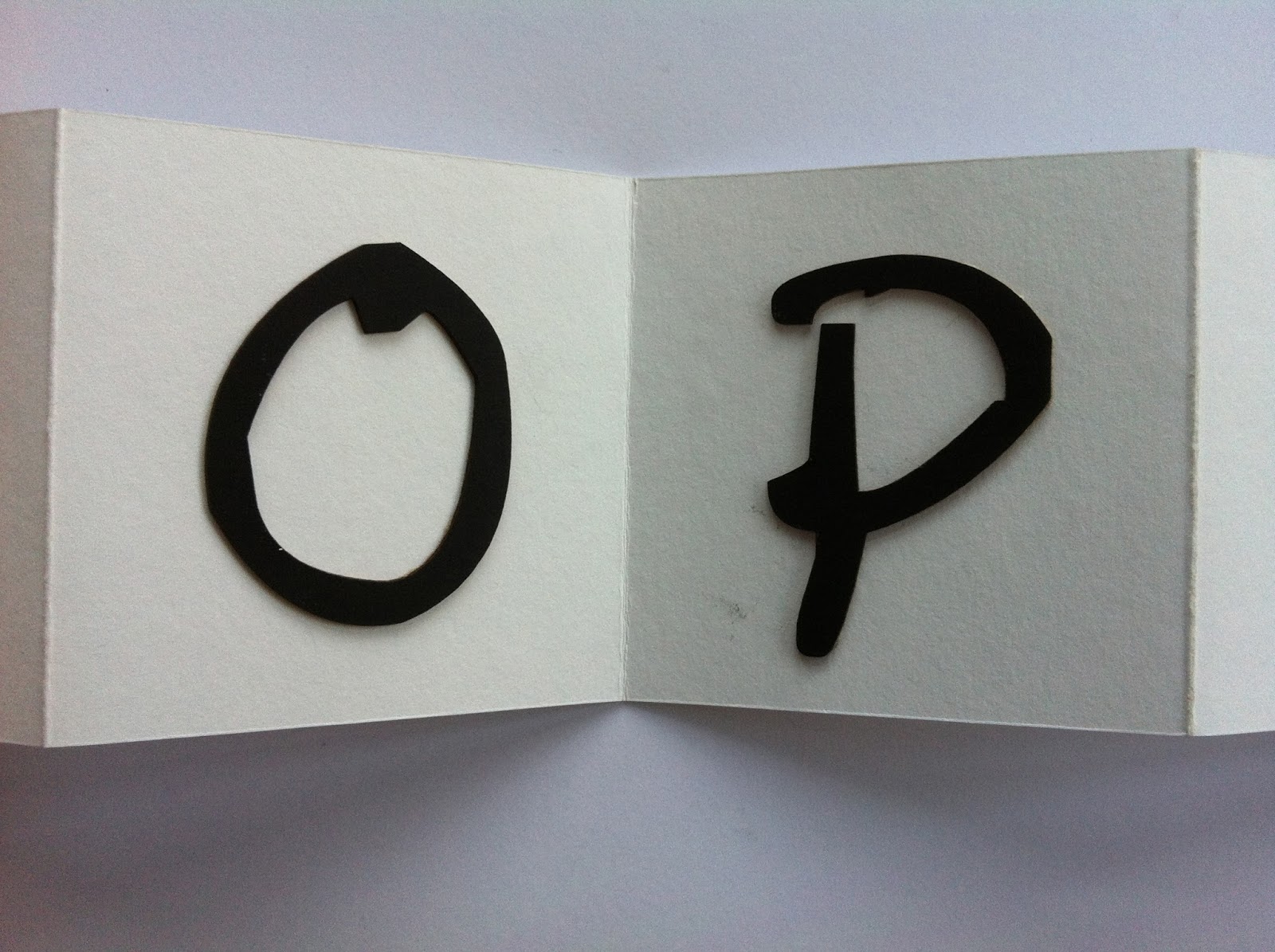


Because the profile of each letter has come from my original handwritten script, in normal hand-writing size, the enlargement to 220 point reveals interesting details in the shape of the line in each letter. So the profile has peculiar irregularities, dips and bends, which show up particularly well in these raised, cut-outs. Here are two good ones - Q and F.


The finished book is 7mm or 3" square and just fits neatly into a slightly larger custon-made box.


I have been a laggardly contributor to ALAW 2013, because, like all of us I guess, lots of other things have demanded my time and attention during the year. However, I have enjoyed having this project at the back of my mind during other distractions, and I feel I have, latterly anyway, got back my initial excitement about the whole idea of creating unique alphabets in this forum. So I hope to be able to carry on into ALAW 2014, but with a firm resolution to make my pieces in proper time and order, and to keep up with regular, if not weekly, postings to the blog.
I've also, as in previous years, much enjoyed seeing other people's work as it has emerged, and am intrigued by your ingenuity and creativity in finding so many ways to present and interpret such familiar but fantastic symbols.
I do like the boldness of these. I like using the positive/negative for the 2 different sets.
ReplyDeleteI think several of us did the alphabet all at once and then scheduled the posts. Yes, not really the original idea, but for me gave me more confidence that my letters would look like part of a whole. I haven't done much of this before and as I was developing my own font each time, I was afraid they would be too dissimilar if I did one a week.
Maybe I will be braver next year - or use an existing font.
Sandy in the UK
I like the contrast between this and your peace letters. These ones do indeed shout out to be noticed. They seem to have a depth to them (shadowing?). And the box is brilliant.
ReplyDeleteYour letters and alphabet are very beautiful!
ReplyDeleteSo cute!
ReplyDelete