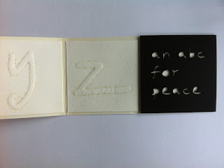
Actually, the 26 letters for my peace alphabet were finished months ago, but the task of assembling them into a book/object has been loitering in the margins of my time/place/consciousness. And with the end of the year in sight, and amid all the hustle and bustle of the holiday season, somehow my letters emerged at the top of my 'to-do' list this weekend. Possibly as a displacement activity (I am always the last person to the post box with my Christmas cards) but who cares? They are done, so here's the result.
I showed the individual letters up to 't', I think, back in July. To re-cap - my letters are based on a hand-written alphabet which was turned into a true-type font via www.yourfonts.com. I used this, at 220 point size which fit pretty well into the 7cm squares for ALAW, to create a file in InDesign which was then laser-cut on 3mm thick card, providing me with relief shapes for embossing onto Somerset print-making paper. The embossing shows the slightly brown edges which come from the laser-cutting process.
I trimmed the individual letters a little, and then mounted them onto cartridge paper to make a concertina-fold book. The end boards were also laser-cut, using the same personalised font, but in 18 point. They are housed in a simple box from 3mm black board, with a white version of the title mounted on the top section.
I was very pleased with the font itself, and have been using it for various documents produced on my computer. It feels good to be able to print things out in something approaching my own handwriting. However, the font isn't transferable on documents I send to other people's computers, unless I also send them the ttf. file.
Blown up to 220 point, the hand-written nature of the letters becomes more obvious and more interesting: every little wobble of the original line shows up and gives unusual edges and twists to the main letter strokes. This shows up well, for example, on the letters 'o' and 'p' .
At the start of the year I was struggling a little to think what I would do for my abc for peace. But these embossed letters have solved the problem. They speak of peace, to me, because they are quiet, in the sense that they are all in lower case (no e-mail 'shouting' here!), they are embossed - so you can feel them rather than 'say' them, there is no colour contrast, but the slightly smoky edges give a hint of the violence of the laser which produced them.


Beautiful job!
ReplyDeleteYour letters are very peaceful to look at, and very professional-looking. The relief embossing is a fantastic technique.
ReplyDelete